The Buffer Fever Chart is a tool that is used extensively in TameFlow and in Critical Chain Project Management (CCPM) used in the Theory of Constraints. For an introduction about the topic, see the earlier posts:
- Critical Chain Project Management in the Theory of Constraints
- Buffer Management and Risk Management in Theory of Constraints
- Visual Portfolio Management
Also, the “TameFlow Book” uses these charts in many chapters. With reference to the book, in a recent email exchange, Alexander Stepanenko commented:
I am a bit confused by the inconsistency in painting the Red-Amber-Green (RAG) areas on the buffer control, burn up and fever charts. Usually we split our control buffer in 3 equal parts (0-33% green, 33-66% amber and 66-100% red). And that exactly what we do on the bigger control chart and on the burn-up chart.
But fever chart is a different story: even across the book I see areas are split differently: the borders between the RAG areas are inclined at different angles so if we, say, have only 10% work done we treat the buffer consumption of 30% as amber, while at 80% work done we treat 70% of buffer consumed as green.
Don’t we need simply to divide the area by 2 horizontal lines at 33 and 66% as we do on the buffer control chart? Otherwise we get different criteria on different charts and this is obviously not something I would like to communicate to the product owner…

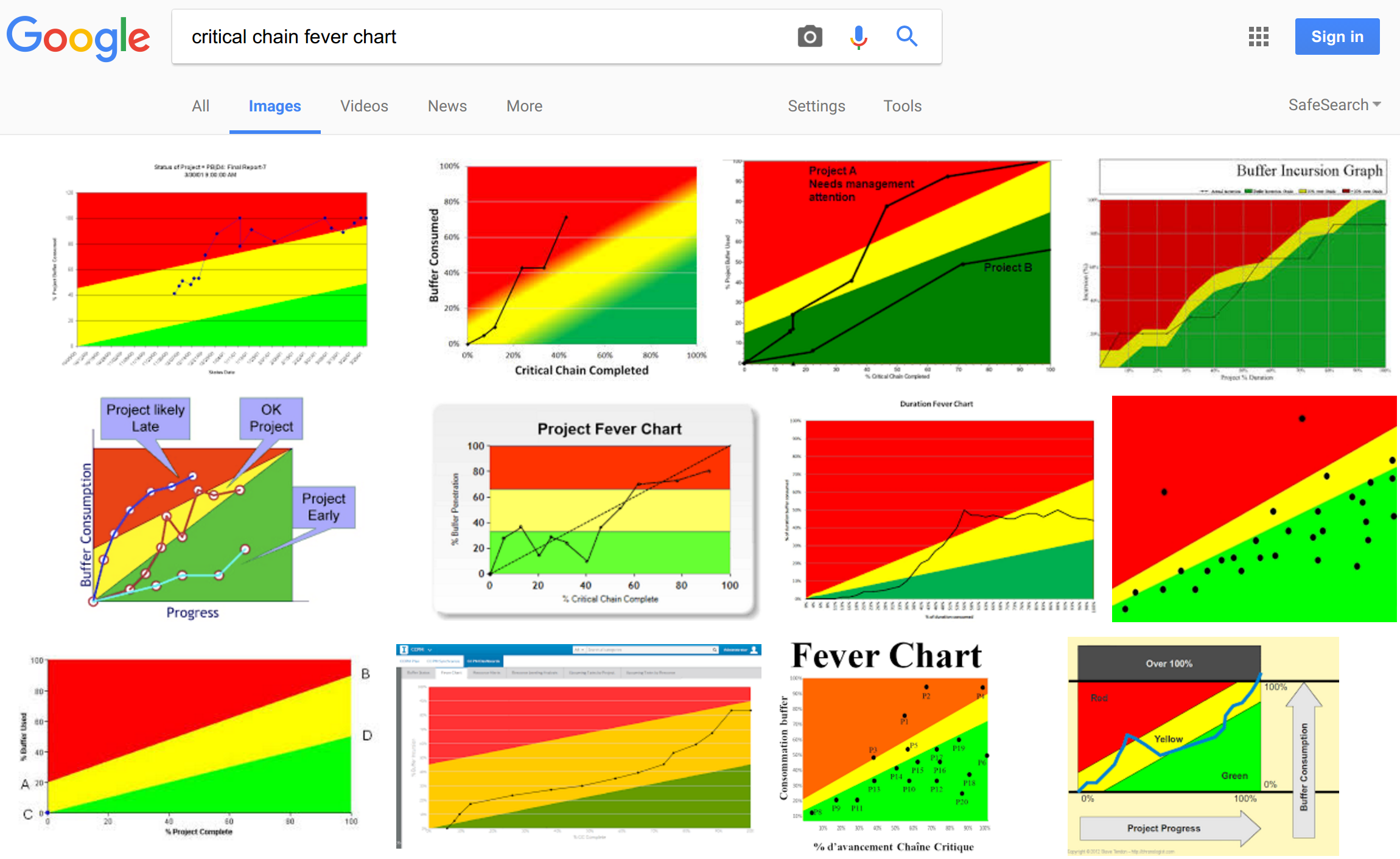
While all these images display the three colored zones, they are not much consistent. The one that Alexander was referring to is the second one from left, in the middle row. In consideration of the fact that in the book it is recommended to divide the buffer in thirds, Alexander further comments:
As we see the buffer penetration axis is broken by 3 horizontal lines dividing the RAG areas. And this looks consistent with the 1/3 approach.
These observations are absolutely correct. If you want the same signals on all charts, you have to draw the zones as suggested by Alexander; but the problem then becomes that you go amiss one of the benefits of the fever chart. 2017-03-30-how-to-draw-buffer-fever-charts A fever chart (as originally used in CCPM) typically has a different signaling logic, and can even be drawn without the RGB zones. The signal is given by the Buffer Burn Rate (BBR), i.e. the percent of buffer consumed over the percent of completion, with the following logic:
- if BBR < 1, then it is green.
- if BBR approximately 1 then yellow.
- if BBR > 1, then it is red.
Clearly, because of this logic, the status signal (RAG) in a fever chart differs from the status signal reflected by buffer region percentages (the RAG boundaries in the buffer itself), which you might see in a burn up chart with buffer zones, or in a buffer control chart. That’s exactly what Alexander observed.
The intent of a fever chart is to capture the “velocity” of buffer consumption (the BBR), and react early, as soon as it becomes unfavorable.
Unfortunately - in a way - the CCPM tradition has “simplified” the above logic by just drawing zones, with different slopes. And in the book we stuck with that simplified logic.
It is a heuristic, but generally it works well.
Furthermore, there is no unanimous way to do that; that is why we will see different slopes, from different sources. It is a (compromising) heuristic to visually get a signal without being concerned about the actual numeric value of the BBR. So even the horizontal lines suggested by Alexander would be consistent with this tradition! :-) Being a heuristic, there are many degrees of freedom.
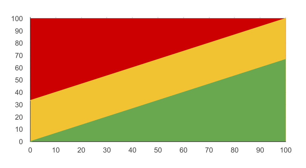
Nowadays, if I have to draw a fever chart with RAG zones, then I prefer to draw the chart as suggested by Prof. Holt (Washintgon State University), and give it a 2:1 aspect ratio. Then I draw the Amber-Green line between (0%, 0%) and (100%, 66%); and the RA line between (0%, 33%) and (100%, 100%). It gives (more or less) the same signals as the above BBR logic.
It would look like this:

Thus the fever chart gives even earlier leading signals than the other buffer penetration diagrams, because it is based on buffer burn rate, not on buffer consumption. This way you can expect and explain that the signals are different, and that the fever chart will give you a very early leading signal. In practice, you should look for a “heads-up” on the fever chart (buffer burn rate), and then for the confirmation on the other charts (buffer consumption). An integrated view could be one with the buffer consumption drawn as a thermometer on the Y axis of the fever chart: that way you would have both signals in the same diagram.
Alexander’s comments on the above was:
Such RAG zones division makes even more sense to me because it takes into account the overall project progress while issuing signals. If I understand your idea correctly the buffer we introduce is rather controlling than protective, so we’re OK to have it all (or almost all) consumed as soon as we have the project done before the due date. And taking this into account I believe it’s obvious that if we have 99% of the project done and 90% of the buffer consumed it’s rather amber (or even green) zone, but not the red one. Looking only on the buffer consumption index we’ll say that we’re Red, but looking at the Fever chart - we’re green or amber. And vice versa - at the very beginning of the project (let’s say 5% done) if we have 30% of the buffer consumed we’re green according to the buffer penetration index, but we’re obviously not green from the common sense prospect - it’s not good to have almost third of the buffer consumed at the very beginning of the project and may lead to even more hard issues later.
The rationale of the BBR and the drawing of the RAG zones as described above could not have been expressed better! Indeed, the buffer is not so much a protection mechanism, but rather a signaling device. Since we determine the buffer size/placement statistically, we are still within what is “acceptable” performance if we deliver at the very last drop of the buffer. Remember that typically we start the buffer at 50%… so there is almost just as much to go to get to 99%.
In conclusion: there are many ways to draw the RAG zones in a buffer fever chart. The above are only guidelines. What really matters is that the signals that you read off the chart are significant for your particular project. If the above doesn’t work, experiment! Maybe you will end up with even more fancy fever charts than those we found above with the Google image search!