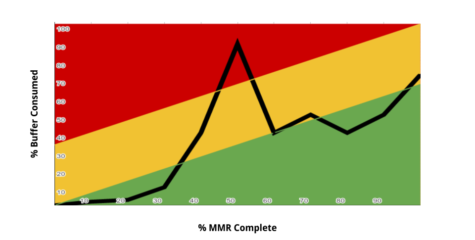
In an earlier post, Buffer Management and Risk Management in the Theory of Constraints, the ideas of buffer management was introduced. In particular, we saw the use of buffer fever chart to represent the health of a single project, typically like this:

In this post, extracted from Hyper-Productive Knowledge Work Performance, we will see how the same idea can be extended to oversee and visually manage a whole portfolio of projects.
It is easy to fall into the trap of thinking that portfolio management is just about managing and synchronizing a multitude of projects, which might even share resources. Even in this instance a systems’ thinking approach is necessary — it is not only about managing many projects, but it is about managing them carefully so that each of them maximizes their contribution to the overall success of the company. Notice that it is not about maximizing the result of every single project in isolation; it is about maximizing the result of the set of project’s outcomes as a whole for the company.
When there are a number of projects to examine, it becomes very important to know how they are doing with respect to one another. It is beneficial to know what the buffer status is and how it is trending for all projects at the same time. How can this be achieved without information overload? It can be achieved very simply with a variation of the buffer fever chart.
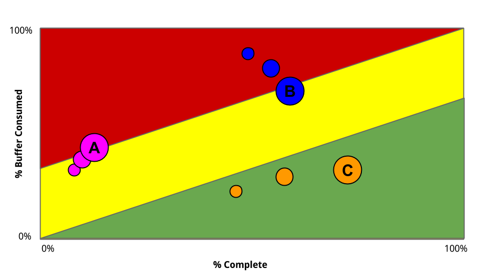
The same diagram is drawn, but instead of plotting a line representing a single project, each different project is represented by a set of decreasingly smaller bubbles, as shown in the figure.

Every set of colored bubbles represents a point for that project in an earlier reporting period. In the figure, the status is reported about three projects: A, B, and C. The figure represents three reporting periods (weeks, months, etc.), illustrated by the different sizes of the bubbles — the biggest bubble is the current period, and the smallest is the most remote in time.
The figure highlights how Project A is going very slowly: the bubbles seem to pile up into each other, like cars in rush hour. Also Project A is going from yellow to red, so some action needs to be taken. Project B is progressing faster than Project A—the bubbles are more spread out and leave a longer trail. Project B is recovering, going from red to yellow. Project C is going very well. It is the fastest, the bubble trail is very long, and it is progressing toward early delivery.
By looking at this chart, the portfolio manager should make the decision to use the extra capacity of Project C to help Project A recover, naturally assuming that the necessary skills and knowledge are available in Project C. If the skills and knowledge are not available, then people from Project C should still try to learn the skills and acquire the knowledge needed to support Project A. Keep in mind that the people who will do this on Project C are those who are the veterans, the most skilled and experienced ones on that project, precisely because of how slack is managed with respect to staff liquidity. (For a deeper explanation of these concepts, see the book from which this post is extracted.)
The representation of the fever bubble chart is vivid, and its interpretation is immediate. The purpose is to move the bubbles from left to right as soon as possible; and whenever there might be conflicting priorities, only economic considerations that benefit the portfolio as a whole should be used to decide where action should be focused. The project/product owners will trust each other (Community of Trust) because they will be helping each other, and they will see the common goal (Unity of Purpose). Portfolio management with a systems’ thinking approach is, thus, entirely consistent and supportive of the noble patterns of Community of Trust and Unity of Purpose.
With this kind of visual reporting many unnecessary meetings (status meetings, Scrum of Scrums, review meetings, etc.) can be avoided. This avoids a lot of waste in the form of time spent in such unnecessary meetings. Instead, meetings will be called for only when there are signs of trouble, and they will be focused precisely on the troubled spots. The approach will also give ideas about where help can come from, and prevents team territoriality to develop. The common agreement is about everybody collaborating and collectively taking the best actions that benefit the organization as a whole, rather than just a single team or project.
Update 2017-03-30:
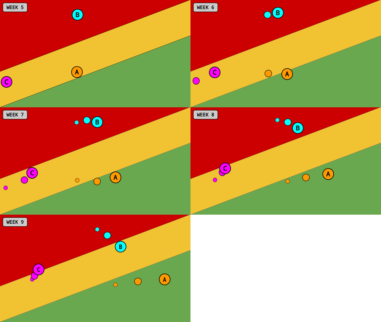
To make the dynamic of the overview even more compelling, it is often useful to show a time series of bubble-charts, as an animation. It could then look like this:

You might also want to check this follow up post: How To Draw Buffer Fever Charts
For more information about how to build a Community of Trust driven by a Unity of Purpose to achieve superior organizational performance, please refer to Hyper-Productive Knowledge Work Performance.